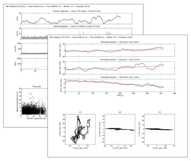
The plots contain a lot of information and can be quite challenging to read. Therefore, we will, in the following, go through all the different parts of the plots.
For all of these plots, the three dimensions (XYZ) have the following meaning:
- X = sideways motion
- Y = front-back motion
- Z = up-down motion
All of the data has been normalised for each participant. This means that they have been changed so that the average value is always 0 in all planes. That makes it easier to compare data between people.
Position plots
The first set of plots show the position of the marker in the three dimensions (XYZ). All the raw data are plotted first (grey line). This graph is quite chaotic. Therefore, we also plot a "smoothed" line (black) on top. Finally, there is a trend line (red), which shows which direction the data moves.
Note that the vertical axes (the left side) of the plots do not have the same values. There are larger values for the front-back motion (Y dimension) than the sideways motion (X dimension). The least motion can be seen in the vertical motion (Z dimension). Here it is more common to see either a gradual increase or decrease over time.
The data are shown for all the 360 seconds (= 6 minutes) that were recorded.
XY Plots
The next set of plots are only showing motion in space, there is no time axis. They differ in the way that two and two of the axes are plotted together (XY, XZ, and YZ).
The most intuitive of these plots are the XY plots. These can be thought of as a "bird's eye" view of the motion. Imagine that you are sitting in the ceiling of the space looking down at the person moving. The nose of the person is pointing upward, so in most of these plots you will see that most motion is happening on the vertical axis. Our feet keep us more stable sideways, so it is expected that we sway most back and forth.
Derivative plots
If we turn to the plots on the other sheet (the "b page"), these are slightly different. Here we do not any longer look at each of the three dimensions (XYZ). Instead, these plots show the magnitude of the motion. This is calculated by combining the three axes into one figure.
The position magnitude can be thought of as the "quantity of motion". This is low when there is little motion and higher when there is more. So it can be used to see where there is more motion in the graph.
The speed plot has been calculated by taking the first derivative of the position. This tells something about the changes in motion over time. Similarly, the acceleration plot represents the second derivative of the position. The speed and acceleration can be useful to detect changes in the data.
Finally, one of the most interesting plots on this page is that of the cumulative distance travelled. This looks at the change in position between every single sample and adds them together. If the line is straight, it means that the person moved similarly throughout the whole experiment.
Other plots
The last plots may not be particularly interesting for standstill data, but they often reveal useful things about other types of motion. The phase plot shows relationships between position and speed. This can reveal rhythmic patterns in the motion. The histogram tells about the distribution of the motion, and whether it is skewed in one direction or another.
Finally, the spectrum plot shows whether there are any particular frequencies that stick out. Since the standstill data are quite noisy in nature, this usually does not show anything. However, sometimes we see a spike in the data, and this is often because of some error in the measurement.
Want to learn more?
There are several more advanced ways of analysing such data. If you are interested in learning more about how the data can be analysed, we have made a lot of our analysis files openly available. See, for example, this Jupyter notebook based on data from the 2012 Championship.


